
A good user interface gets out of the way and makes it easy for teams to understand, focus on, and complete their work. We’ve been listening to our users on how to improve the navigation of Bitbucket Cloud’s UI and have been hard at work for over a year to address the feedback. Today we’re taking the first step in improving Bitbucket Cloud’s UI and launching a new navigation experience.
As part of this new UI, we’ve streamlined navigation to create a more intuitive, warm, and inviting interface. Let’s take a deeper look at how we arrived at this new design, what it looks like and how you can enable it.
How did we land on this new design?
One of the best signals we have to understand our customers is NPS (Net Promoter Score) feedback. We pulled a research team together to sift through thousands of NPS responses to find common pain points and opportunities for improvement. One recurring theme we found was “complexity” – clearly a problem, but tough to address without breaking it down further. So, we conducted qualitative interviews and narrowed down areas of improvement to address perceived complexity:
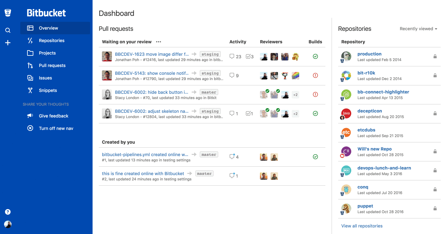
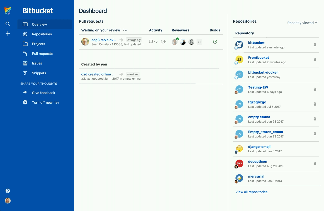
- Wayfinding and architecture – Historically Bitbucket has used many interaction patterns for navigation: top bar menu, search box, sidebar, omni-bar, and tabs (oh my!). That’s led to a frustrating user experience when finding features and getting around. To cut out the visual noise and distractions, we’ve combined global and repository-level navigation into the left sidebar. The dashboard and search menus let you quickly jump between all repos, pull requests, and issues you need to manage.
Before
 After
After
- Look and feel – Users had feedback about Bitbucket’s fluid width, iconography, lack of color and whitespace. They expected an easy to use and cohesive experience that surfaced the right information at the right time. With the new nav, we removed clutter, use flashes of color and clear iconography to accentuate the important bits. These new interactions are more considerate, straightforward, and guide you to the next step. We’ve got more to do on this front to make the entire Bitbucket experience more consistent and simpler, but we’re excited about this start!
Before
After
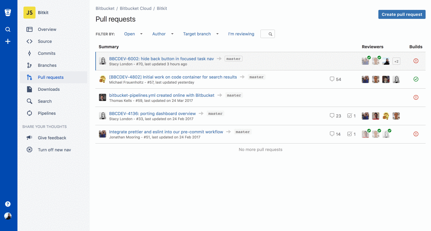
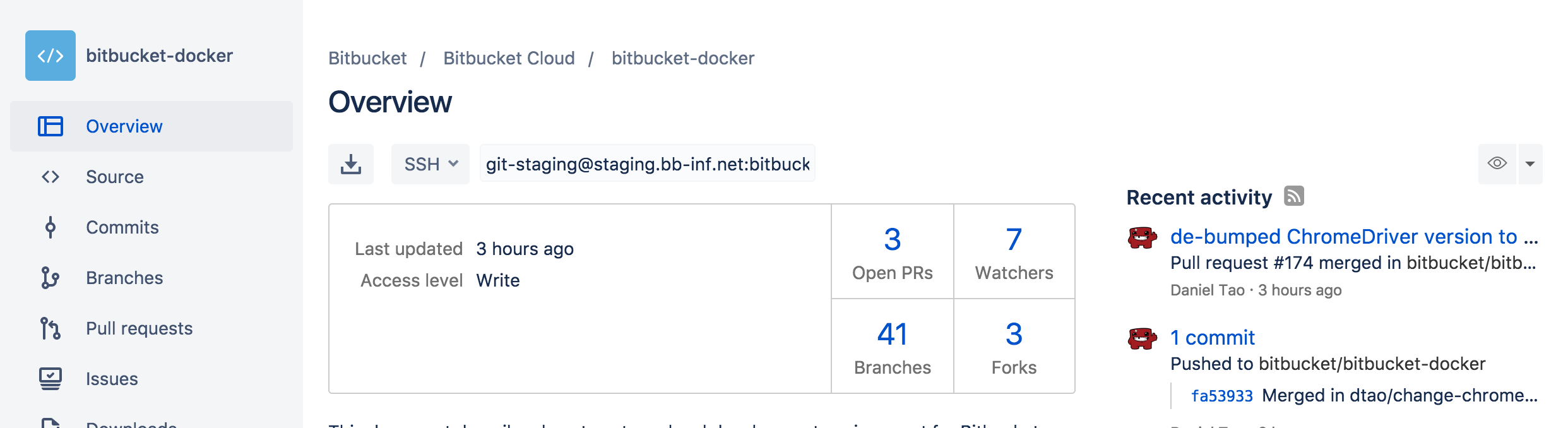
- Repository navigation – This was unintuitive because icons were not easily understood. There were too many options and the mix of actions and navigation made it difficult to parse. As part of the UI cleanup, we wanted to remove as many of the hurdles between you and your work as possible. To simplify, we’ve grouped repo actions with other actions in the create (plus) menu and kept navigation simple.
Before
![]()
After
How did we test the new UI?
We’ve been testing our design direction from the beginning with actual users to validate and stay on track. Usertesting.com was hugely helpful for early signal testing and getting quick qualitative feedback from real users. Building on those positive results, we shipped an initial implementation in Bitbucket in October 2016 to our internal Bitbucket dev team.
Since then, we’ve expanded from just the Bitbucket dev team to hundreds of users, integration partners, and Atlassians and have received overwhelmingly positive feedback. Any UI change, especially one as large as adopting a new navigation paradigm, involves tough calls and tradeoffs. Based on our research and testing, we’re optimistic that people will intuitively understand the new layout and be even more productive with Bitbucket.
Most recent updates
Since we launched the new navigation experience back in April, we’ve been gathering a ton of feedback from our users—the good, the bad and ugly—and we’ve made some updates. So what did we change?
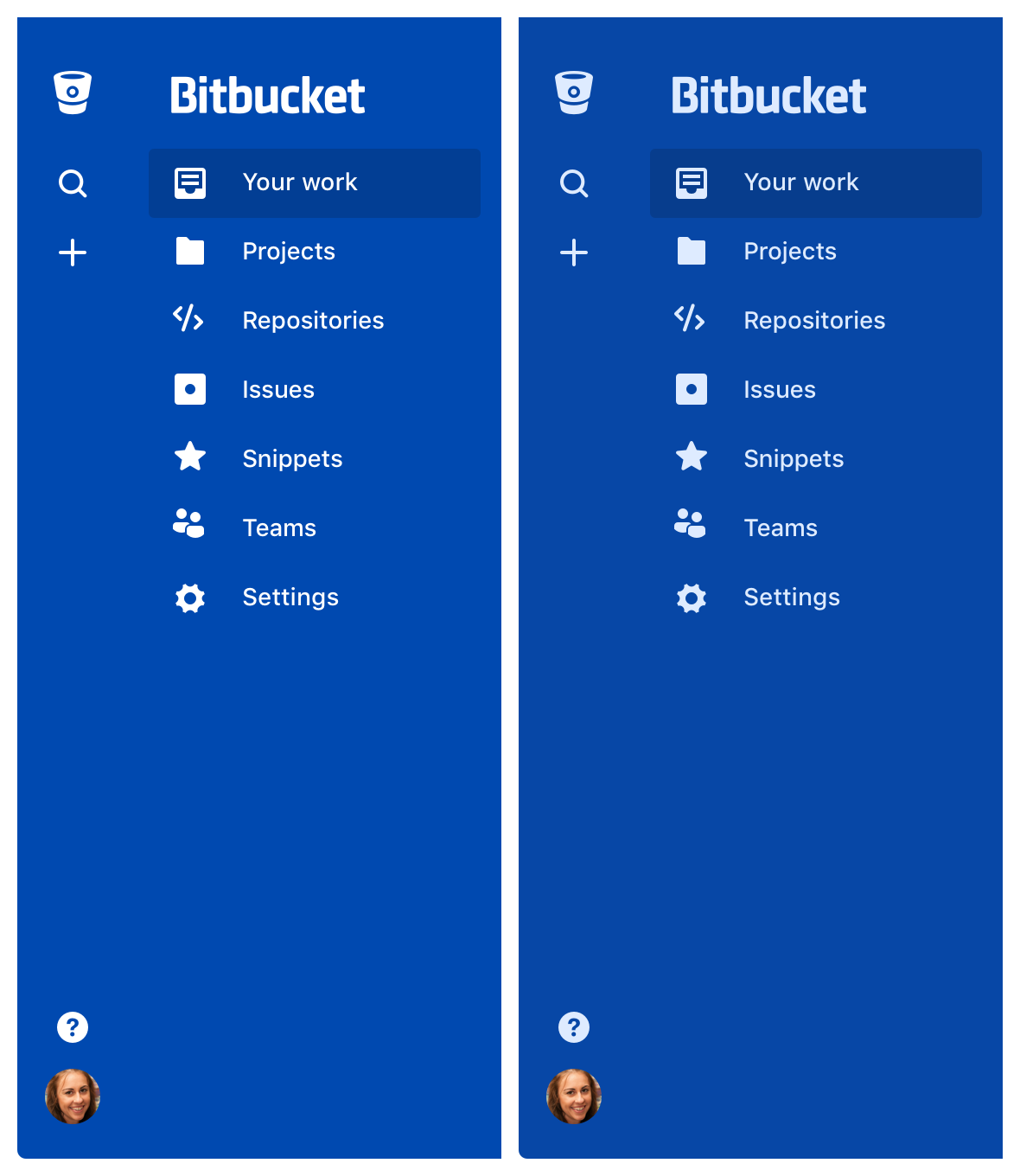
- Blue color: the contrast of white text on the blue background of the global navigation was causing issues with readability so we altered the blue and lowered the contrast between the blue and white. You can compare below (old left, new right)
- Keyboard shortcuts: in the first iteration of our new design, keyboard shortcuts were temporarily removed, but not for long. You can access the guide for all the shortcuts by hitting `shift + ?`
- Badges for Pull Requests: We originally removed badges for pull requests from the new design because there was a performance hit every time the page loaded. We know this is an important count that many of you rely on, so we’ve placed it in the stats on the repository overview page as an interim step and are continuing to explore ways to surface that information.
- Access to your teams: Teams are now accessible under your profile picture.
I have feedback on the new Bitbucket experience! How do I give it?
This initial roll out is just the beginning. We’ve started with navigation, updated bitbucket.org, and changes are now starting to flow in to product.
Now after all this testing, it is time to get feedback on a larger scale. We’re going to be continuing to improve the UI, the navigation, and all the things. While we do that, we’d love to continue getting feedback. To give us feedback, click on your profile picture and navigate to the “Give feedback” link to give us your thoughts. We’re listening! If you’re not already a Bitbucket user, sign up for Bitbucket to give it a try. Give us feedback and we hope you love the new UI as much as we do.
Have more specific questions about this post? Reach out to us on Twitter to get the information you need.

